Visual Content Marketing Strategy: Framework And Examples

Most brands publish blog posts, hope for the best, and wonder why engagement stays flat. The missing piece is often a visual content marketing strategy, a deliberate plan for using images, videos, infographics, and other visual formats to attract, engage, and convert your audience. Research consistently shows that people process visuals faster than text, and content with relevant images gets significantly more views than content without them. Yet most businesses treat visuals as an afterthought, slapping a stock photo on a blog post and calling it done.
A strong visual strategy does more than make your content look nice. It reinforces your brand identity, improves comprehension, and gives your pages a real edge in search results, especially as Google increasingly rewards rich, engaging content. When you pair visual content with solid SEO fundamentals like keyword targeting, search intent alignment, and consistent publishing, the results compound quickly.
That's exactly the kind of compounding effect we built RankYak to create. Our platform automates the SEO content lifecycle, from keyword discovery to publishing, so you can focus on higher-level strategy like building out your visual content plan. This guide breaks down a practical framework for developing your own visual content marketing strategy, complete with real examples and actionable steps you can start using right away. Whether you're a solo founder or managing content across multiple sites, you'll walk away with a clear playbook for making visuals a core part of your growth engine.
What a visual content marketing strategy is
A visual content marketing strategy is a documented plan that defines how you'll use visual media, including images, videos, infographics, charts, and illustrations, to achieve specific marketing goals. It's not just a style guide or a list of image types. It covers which formats you'll use, why, where you'll distribute them, and how you'll measure their impact. Think of it as the connective tissue between your brand identity and your content output.
A visual content marketing strategy turns scattered creative decisions into a repeatable system that builds brand recognition and drives measurable results.
Without a strategy, you end up with inconsistent visuals across channels, formats that don't match your audience's preferences, and no clear way to know what's working. Most businesses already produce some visual content; the strategy is what transforms those one-off pieces into a growth engine rather than a collection of disconnected assets.
The core components
Every solid visual content marketing strategy shares a few fundamental building blocks. Understanding these components upfront saves you from building a plan that collapses the moment you try to scale it, so treat each one as non-negotiable before you start producing anything.
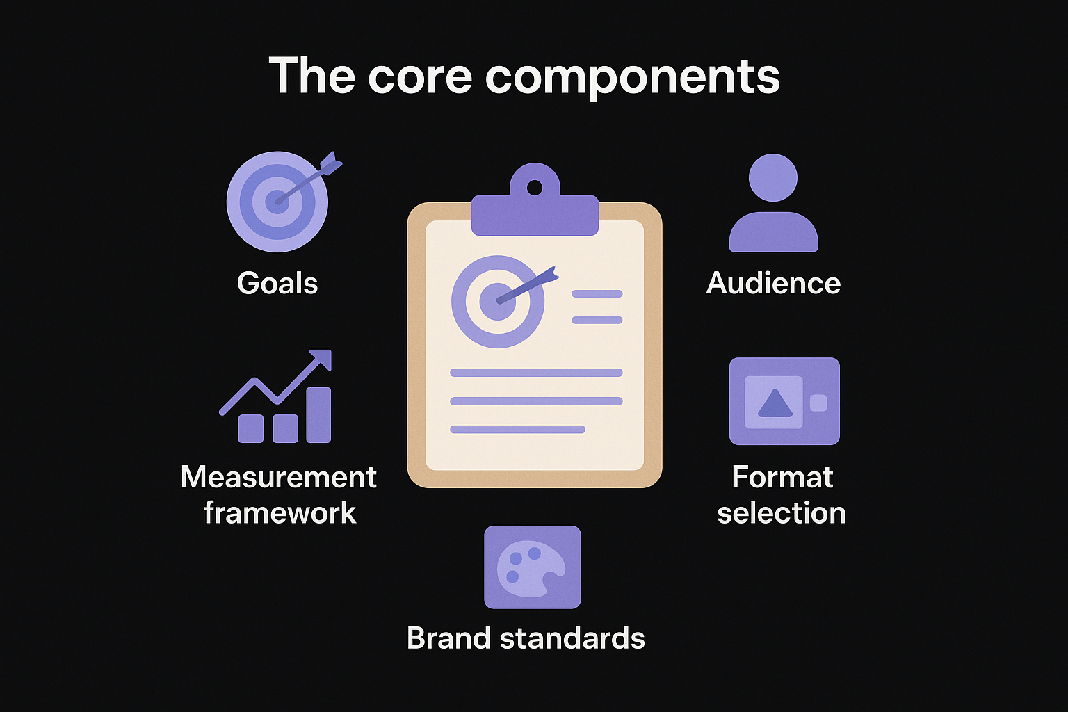
- Goals: What you want visuals to accomplish, whether that's brand awareness, more time on page, higher conversion rates, or more shares.
- Audience: Who you're creating for, including their preferred platforms, content consumption habits, and the types of visuals that resonate with them.
- Format selection: Which visual types serve your goals best, from short-form video and static infographics to data visualizations and carousel posts.
- Brand standards: The rules governing your color palette, typography, logo usage, and visual tone so every piece looks like it came from the same source.
- Distribution channels: Where your visuals live and how they reach your audience, from your blog and email list to social platforms and video hosting.
- Measurement framework: The specific metrics you'll track to evaluate performance and decide what to keep, cut, or scale.
These components work together as a system. Skipping even one of them creates gaps that eventually surface as inconsistent content, wasted budget, or visuals that attract clicks but fail to convert your audience into customers.
How it differs from general content marketing
General content marketing focuses on creating and distributing valuable information to attract and retain an audience, and visuals can support that goal in many ways. A visual content marketing strategy goes further by putting visual formats at the center of the plan rather than treating them as decoration added after the words are written.
For example, a general content strategy might call for publishing two blog posts per week. A visual strategy asks: what visual elements will each post include, do those visuals need to be optimized for Pinterest or LinkedIn, and can you repurpose the core data into a standalone infographic? The visual layer shapes decisions about format, platform fit, and repurposing before you create a single asset.
This distinction matters because visual content requires different production resources than written content. Videos need scripts, recording equipment, and editing time. Infographics need data sourcing and design work. Carousels need structured copy and layout templates. Without a dedicated strategy, these requirements catch teams off guard and lead to inconsistent output or missed publishing windows.
A clear strategy lets you plan production capacity, set realistic publishing schedules, and build repeatable workflows that keep your visual content running without burning out whoever is responsible for it. That kind of operational clarity is what separates brands that consistently show up with strong visuals from those that post sporadically and wonder why results don't follow.
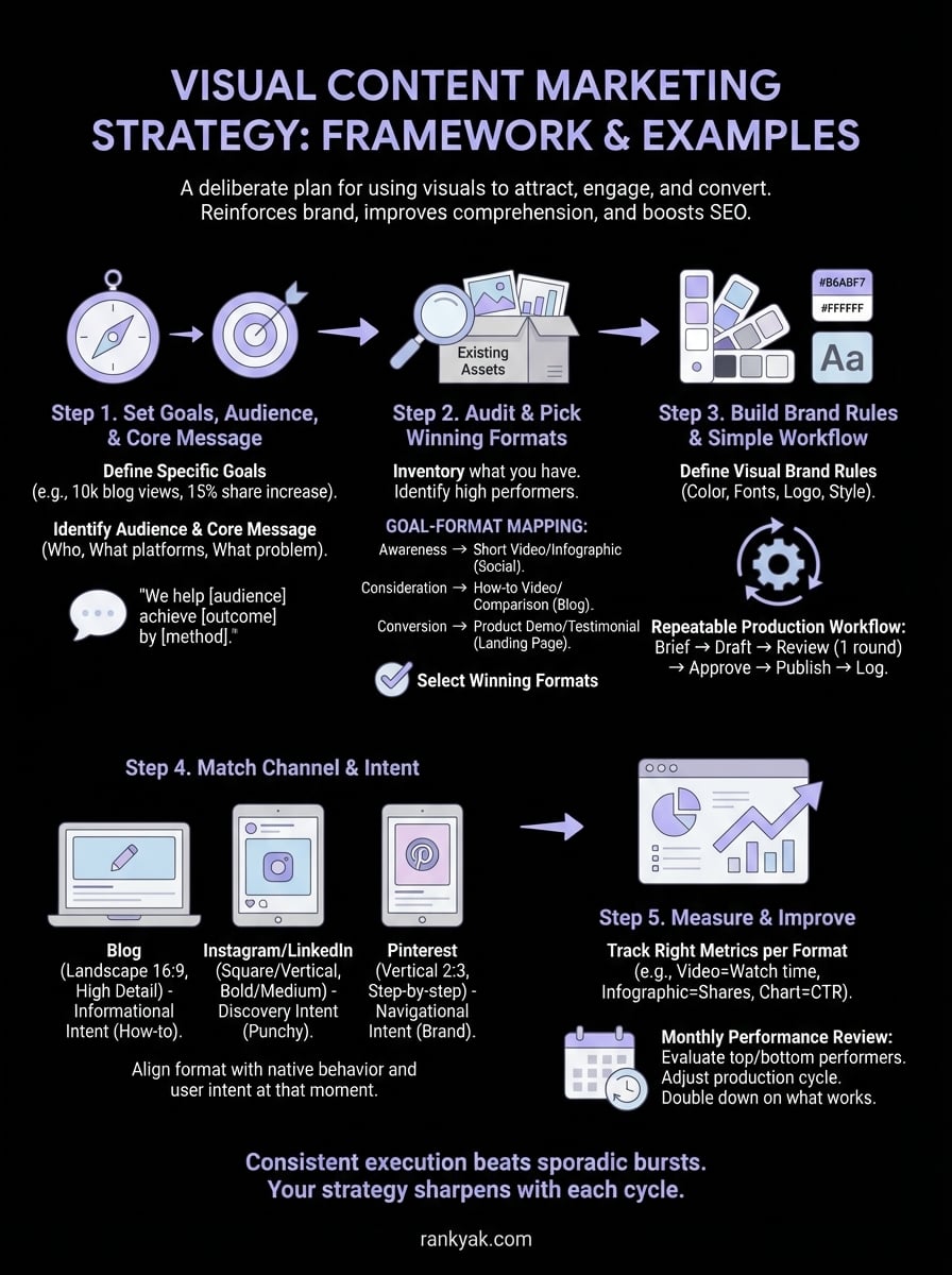
Step 1. Set goals, audience, and your core message
Before you create a single visual, you need three things locked in: clear goals, a specific audience definition, and a core message that ties every piece of content back to your brand. Skipping this step leads to visually polished content that generates zero business results. Your visual content marketing strategy lives or dies by the clarity you establish here, so treat this as the foundation, not a formality.
Define your goals with specificity
Vague goals like "increase brand awareness" give you nothing to measure and nothing to optimize. Instead, tie each visual content goal to a specific metric so you always know whether your efforts are working. Start by identifying what you want visuals to accomplish at each stage of the funnel, from attracting new visitors to converting readers into customers.
Here are examples of specific, measurable visual content goals:
| Goal Type | Vague Version | Specific Version |
|---|---|---|
| Awareness | More views | 10,000 monthly blog page views by Q3 |
| Engagement | More shares | 15% increase in social shares per post |
| Conversion | More signups | 5% click-through rate on infographic CTAs |
| Retention | Better content | 3-minute average time on page for video posts |
Setting specific goals before you start producing visuals keeps your team aligned and gives you a real benchmark to improve against rather than guessing.
Identify your audience and nail the core message
Knowing who you're creating for shapes every format decision you'll make, from video length to illustration style to color choices. Start by answering three questions about your audience: What platforms do they use daily? What content formats do they actually watch or read through? What problems are they trying to solve right now?
Once you have clear answers, write a one-sentence core message that every visual piece should reinforce. Use this template:
We help [target audience] achieve [specific outcome] by [unique approach or method].
For example: "We help small business owners increase organic traffic by automating their entire SEO content process."
Every visual you create should connect back to this message, whether directly through copy or indirectly through tone and composition. This consistency builds brand recognition over time and ensures your visuals reinforce what makes your business worth paying attention to, rather than blending into the noise.
Step 2. Audit what you have and pick winning formats
Before you spend time and budget creating new visuals, inventory what you already have. Most businesses sit on more usable visual content than they realize, including old infographics, product photos, screenshots, and recorded webinars that could be updated or repurposed into something stronger. Running a quick audit gives you a realistic picture of your starting point and prevents you from duplicating work that already exists in some forgotten shared folder.
Take stock of your existing visual assets
Pull together every visual asset your business has produced in the last 12 to 18 months. Organize them by format, channel, and performance so you can see at a glance what exists, where it lives, and whether it drove any measurable results. Use a simple spreadsheet to log each asset with the following fields:
| Field | What to record |
|---|---|
| Asset type | Infographic, video, chart, photo, carousel |
| Channel | Blog, email, Instagram, LinkedIn, YouTube |
| Date created | Month and year |
| Performance | Views, shares, clicks, or conversions |
| Reuse potential | Can it be updated or repurposed? |
Once your inventory is complete, flag every asset that performed above average and note the format it used. These high performers become your benchmarks for what resonates with your audience before you invest in producing anything new.
Match formats to your goals and channels
Your visual content marketing strategy needs to pair each content goal with the format most likely to achieve it. Different channels reward different visual types, so a format that drives strong engagement on LinkedIn may perform poorly on Instagram or Pinterest. Use the mapping below as your starting framework:
- Awareness: Short-form videos and bold infographics on social platforms
- Consideration: Detailed how-to videos, comparison charts, and annotated screenshots on your blog
- Conversion: Product demo videos, testimonial graphics, and data-backed visuals on landing pages
- Retention: Email-embedded visuals, branded templates, and recap infographics for existing customers
Pick two or three formats to master first rather than spreading your production resources across every format at once.
Trying to produce every format simultaneously stretches your team thin and produces inconsistent quality across the board. Start with the formats that align most closely with your top-priority goal from Step 1, build a repeatable production process around those, and expand your format library once you have a reliable rhythm in place.
Step 3. Build brand rules and a simple workflow
Without documented brand rules, every person who touches your visual content makes slightly different decisions about color, typography, and layout. The result is a scattered visual identity that erodes trust rather than builds it. Your visual content marketing strategy needs a short, practical style guide that anyone on your team can follow without asking you for clarification every time they open a design tool.
Define your visual brand rules
Your brand rules don't need to be a 50-page document. A one-page reference sheet covering four core elements is enough to keep your visuals consistent across every channel and format. Document these specifics and make the file accessible to everyone who creates content for you:
| Element | What to document |
|---|---|
| Color palette | Primary, secondary, and accent hex codes |
| Typography | Headline font, body font, and size hierarchy |
| Logo usage | Minimum size, clear space rules, approved backgrounds |
| Image style | Photography vs. illustration, tone (bright/muted), subject matter |
Keeping your brand rules in a single shared document cuts production time and eliminates the back-and-forth that slows most visual workflows down.
Once you write your brand rules, test them by handing the document to someone unfamiliar with your brand and asking them to produce one visual from scratch. If they get it right without asking questions, your guide is clear enough to use at scale.
Create a repeatable production workflow
A workflow turns your brand rules into a fixed sequence of steps that removes guesswork and keeps your publishing schedule consistent. Without one, you waste time re-explaining requirements, chasing approvals, and rebuilding assets that missed the brief. Every step in the workflow should have a named owner so nothing sits in limbo waiting for someone to figure out whose responsibility it is.
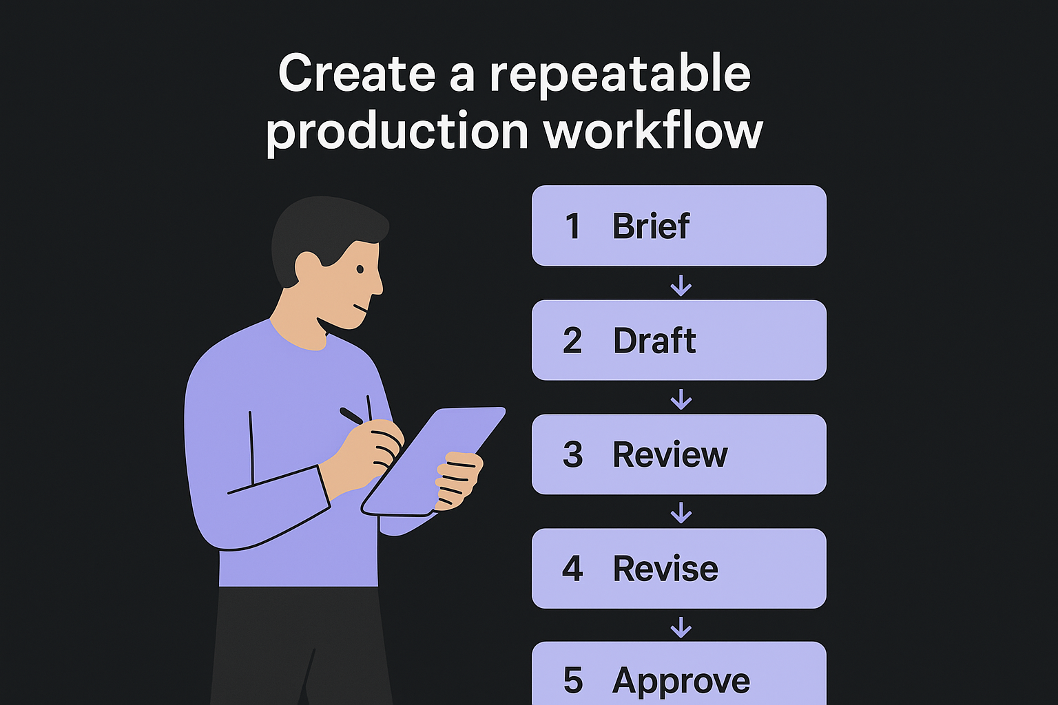
Use this template to build your production workflow:
1. Brief:   Define the visual's goal, format, and target channel
2. Draft:   Produce a first version using brand rules as the guide
3. Review:  Check against brand rules and content goals
4. Revise:  Make edits based on one round of feedback only
5. Approve: Final sign-off from the content lead
6. Publish: Upload or schedule to the target channel
7. Log:     Record the asset in your visual content inventory
Limiting feedback to a single revision round keeps production moving and prevents creative decisions from getting watered down through endless back-and-forth. Set that expectation upfront, put it in the workflow document, and stick to it.
Step 4. Create visuals that match each channel and intent
Your visual content marketing strategy breaks down at the execution stage when you ignore how different channels actually display and distribute content. A high-resolution infographic that performs well on your blog will get cropped and ignored on Instagram Stories. A landscape video optimized for YouTube will look awkward on a LinkedIn feed. Every channel has its own native format expectations, and matching your visuals to those expectations is what separates content that gets traction from content that gets scrolled past.
Match the visual format to the channel's native behavior
Each platform rewards a specific combination of format, dimension, and content density. Before you finalize any visual, check it against the platform's dominant content behavior, meaning what users on that platform actually stop and engage with, not just what the platform technically supports.
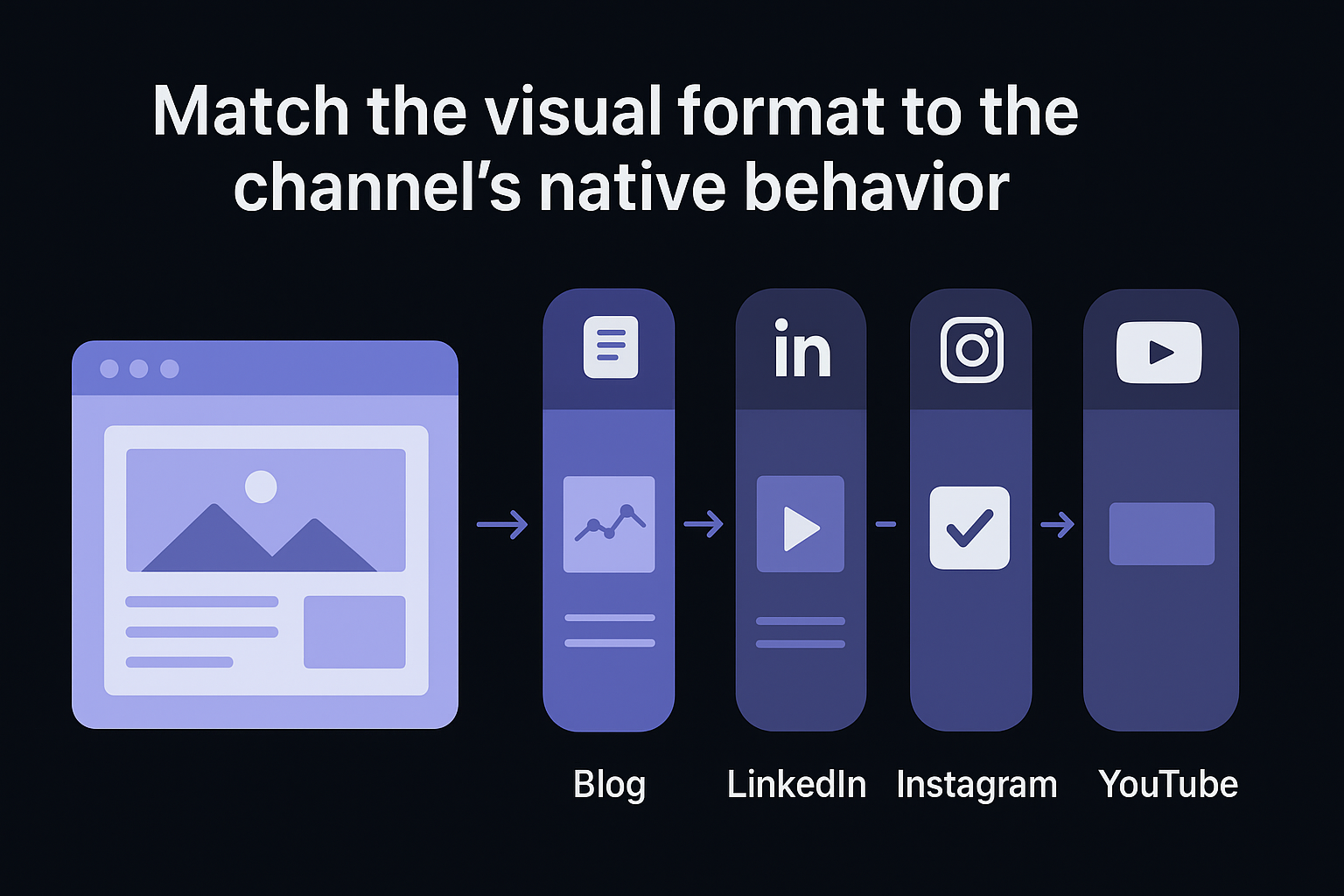
Use this channel-format reference as your production checklist:
| Channel | Best-performing format | Optimal orientation | Content density |
|---|---|---|---|
| Blog | Annotated screenshots, charts | Landscape (16:9) | High detail |
| Data-backed graphics, carousels | Landscape or square | Medium | |
| Bold single-stat graphics, Reels | Square or vertical | Low | |
| Step-by-step infographics | Vertical (2:3 or 4:5) | Medium-high | |
| YouTube | Long-form video, thumbnails | Landscape (16:9) | High |
| Static images, GIFs | Variable, under 600px wide | Low |
Producing the right visual in the wrong format for a channel wastes your production time and signals to the algorithm that your content doesn't belong there.
Align visuals with search and content intent
Beyond channel fit, your visuals need to match the reader's intent at that specific moment. Someone landing on a blog post from a Google search is trying to learn something, so annotated process screenshots and comparison charts serve them better than decorative stock photos. Someone browsing Instagram is in a discovery mindset, so a single bold data point or a short punchy video clip catches attention faster than a dense infographic.
Use this intent-to-format mapping when briefing your next visual:
Informational intent  → How-to diagrams, step-by-step screenshots, explainer videos
Navigational intent   → Brand visuals, logo-forward graphics, product imagery
Transactional intent  → Demo videos, before/after comparisons, testimonial graphics
Commercial intent     → Feature comparison charts, case study visuals, ROI graphics
Applying this mapping at the brief stage prevents you from designing visuals that look sharp but fail to move your audience toward the next logical action.
Step 5. Measure performance and improve what works
Your visual content marketing strategy only improves when you measure it consistently and act on what the data tells you. Most teams either track too many metrics and get overwhelmed, or track the wrong ones and draw conclusions that lead nowhere. The goal here is to build a lean measurement routine that connects your visual content directly to the business outcomes you defined in Step 1, so you spend less time in dashboards and more time improving content that actually moves the needle.
Track the right metrics for each format
Different visual formats produce different types of signals, and mixing those signals together gives you an inaccurate read on what's working. A video that generates 10,000 views but zero clicks tells a different story than a blog infographic that generates 500 views and a 12% click-through rate. Match your measurement approach to the format so you're comparing apples to apples when you evaluate performance across your content mix.
The metric that matters most is the one tied directly to the goal you set for that specific visual, not the vanity number that looks impressive in a report.
Use this format-to-metric reference to build your tracking setup:
| Visual format | Primary metric | Secondary metric |
|---|---|---|
| Infographic (blog) | Time on page | Social shares |
| Short-form video | Watch-through rate | Comments |
| Carousel (LinkedIn) | Swipe-through rate | Profile clicks |
| Chart or data graphic | Click-through rate | Backlinks earned |
| Product demo video | Conversion rate | Drop-off timestamp |
| Email visual | Click rate | Unsubscribe rate |
Run a monthly performance review
A monthly review keeps your strategy responsive without pulling your team into constant analysis. Set aside 60 minutes at the end of each month to evaluate your top and bottom performers, then use the findings to adjust your next production cycle. Follow this review template each month:
Monthly Visual Content Review
-------------------------------
Date:
Formats reviewed:

1. Top performer this month
   - Format:
   - Channel:
   - Primary metric result:
   - Why it worked (your best hypothesis):

2. Lowest performer this month
   - Format:
   - Channel:
   - Primary metric result:
   - Action: Cut / Revise / Retest on different channel

3. One format to increase production next month:
4. One format to reduce or pause next month:
5. Biggest gap between expected and actual performance:
Running this review consistently for three months builds a data trail that reveals patterns invisible in any single month's results, giving you the confidence to double down on what works and cut what doesn't before it drains more of your production budget.
Next Steps
You now have a complete framework for building a visual content marketing strategy that drives real results. Start with Step 1 and resist the urge to skip ahead. Setting clear goals and defining your audience before you touch a design tool is what keeps every subsequent decision grounded in purpose rather than preference.
From there, work through the audit, build your brand rules, and lock in your production workflow before you scale output. Consistent execution beats occasional bursts of high-effort content every time. Use the monthly review template from Step 5 to track what works and cut what doesn't, and your strategy will sharpen with each publishing cycle.
When you're ready to pair your visual strategy with a steady stream of SEO-optimized written content, RankYak automates the entire process from keyword discovery to daily publishing, so you can focus on visuals while your content library grows without adding more hours to your week.

Get Google and ChatGPT traffic on autopilot.
Start today and generate your first article within 15 minutes.
SEO revenue calculator
How much revenue is your website leaving on the table?
Take a quick quiz and see exactly how much organic revenue you're missing out on, along with personalized tips to fix it.
-
4 questions, under 1 minute
-
See traffic and revenue potential
-
No email required
Free · takes 1 minute · no signup needed
Question 1 of 4
Question 2 of 4
Question 3 of 4
Question 4 of 4
Your SEO growth potential
Extra visitors / month
after 6-12 months of consistent publishing
Revenue potential / year
at your niche's avg. conversion rate
Articles needed (12 mo)
to reach this traffic level
ROI with RankYak
at $99/mo ($1,188/year)
To hit that number, you'd need to:
- Build a topical authority strategy for your niche
- Research keywords & map out a full topical cluster
- Write, edit & publish an article every single day
- Build backlinks to the articles you publish
RankYak handles all of this automatically, every day.
* Estimates based on industry averages. Results vary by niche, competition, and domain authority. Most SEO results become visible after 3-6 months of consistent publishing.