Mobile SEO Optimization: Best Practices for Faster Rankings

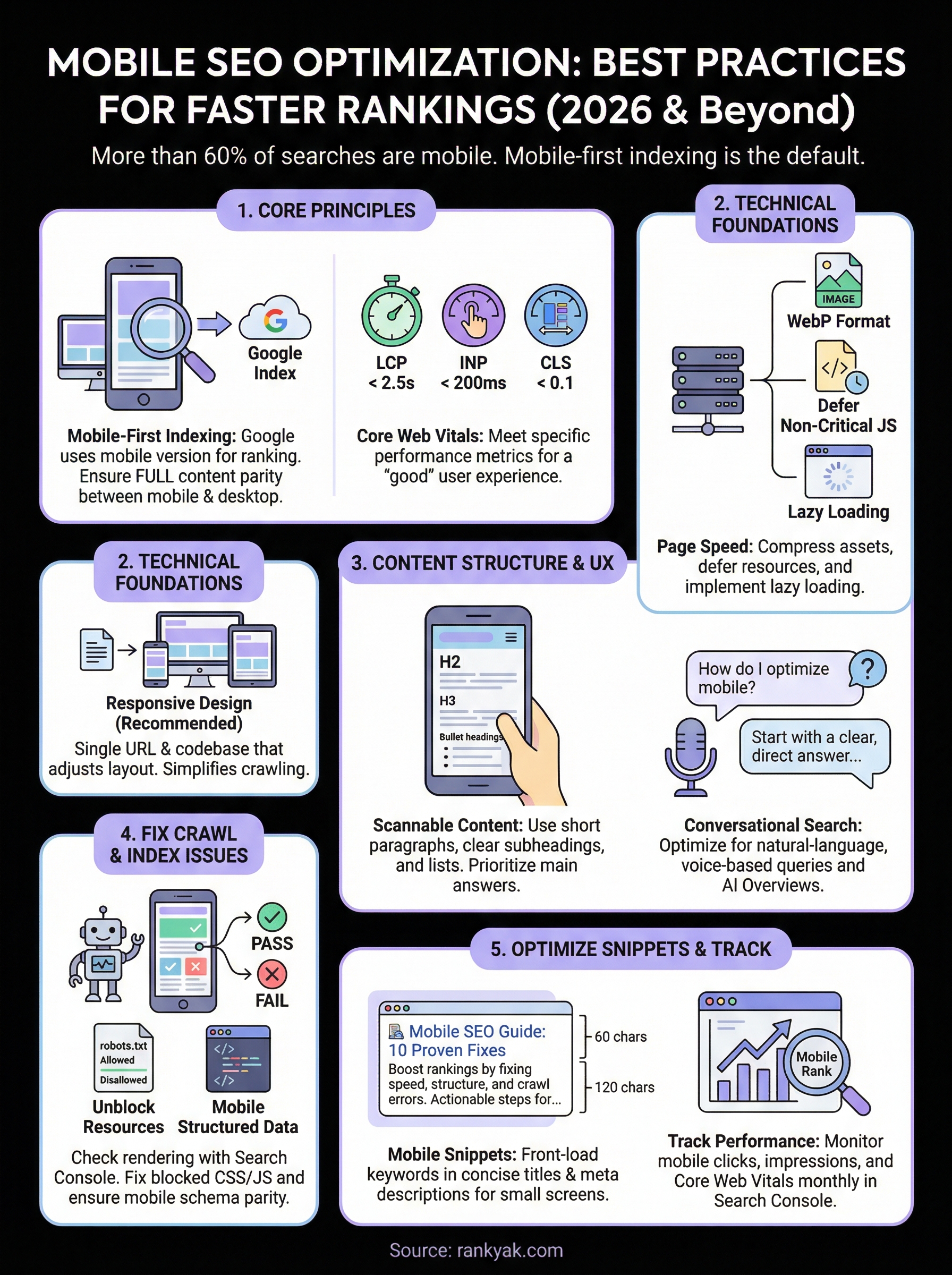
More than 60% of all Google searches now happen on phones and tablets, which means mobile SEO optimization isn't optional anymore, it's the baseline. If your site loads slowly, renders poorly, or frustrates users on a smaller screen, Google will push you down in rankings regardless of how good your content is. And with mobile-first indexing fully rolled out, Google predominantly uses the mobile version of your site for ranking and indexing.
The good news: most mobile SEO fixes are straightforward once you know where to look. The bad news: too many businesses still treat mobile as an afterthought, bolting responsive design onto a desktop-first strategy and hoping for the best. That approach leaves traffic, and revenue, on the table.
This guide breaks down the best practices for mobile SEO in a way you can actually act on, from technical fundamentals like page speed and Core Web Vitals to content structure and user experience. Whether you're doing this manually or using a platform like RankYak to automate your SEO content pipeline, every article and page you publish needs to be built with mobile users in mind. Let's get into the specifics.
What mobile SEO optimization means in 2026
Mobile SEO optimization in 2026 is not a niche strategy you apply after your desktop site is done. Google has been mobile-first since 2019, and by now the entire search ecosystem is built around the mobile experience as the primary ranking signal. That means if the mobile version of your page has thin content, poor structure, or slow load times, your rankings will reflect that, regardless of how polished your desktop version looks.
Mobile-first indexing is the default
Google's crawler now uses the Googlebot smartphone agent to crawl and index your pages. If your mobile site is missing content that exists on your desktop version, Google simply will not see that content for ranking purposes. This catches many businesses off guard: they maintain a stripped-down mobile experience thinking they're being user-friendly, but they're actually hiding content from Google's eyes.
The practical implication is that your mobile and desktop versions need full content parity. Every heading, paragraph, structured data markup, and image alt text that matters for SEO needs to exist on mobile too. You can verify this using Google Search Console's URL Inspection tool, which shows you exactly how Googlebot renders your page.
If your mobile page is missing key content that lives only on the desktop version, you are essentially asking Google to rank a page it cannot fully read.
Core Web Vitals define what "good" looks like
Core Web Vitals are Google's specific set of performance metrics that measure real-world user experience. Three metrics remain central: Largest Contentful Paint (LCP), which measures how fast the main content loads; Interaction to Next Paint (INP), which measures responsiveness; and Cumulative Layout Shift (CLS), which measures visual stability. Google uses these as ranking signals, and they matter more on mobile because slower connections and lower-powered devices make performance problems more severe.
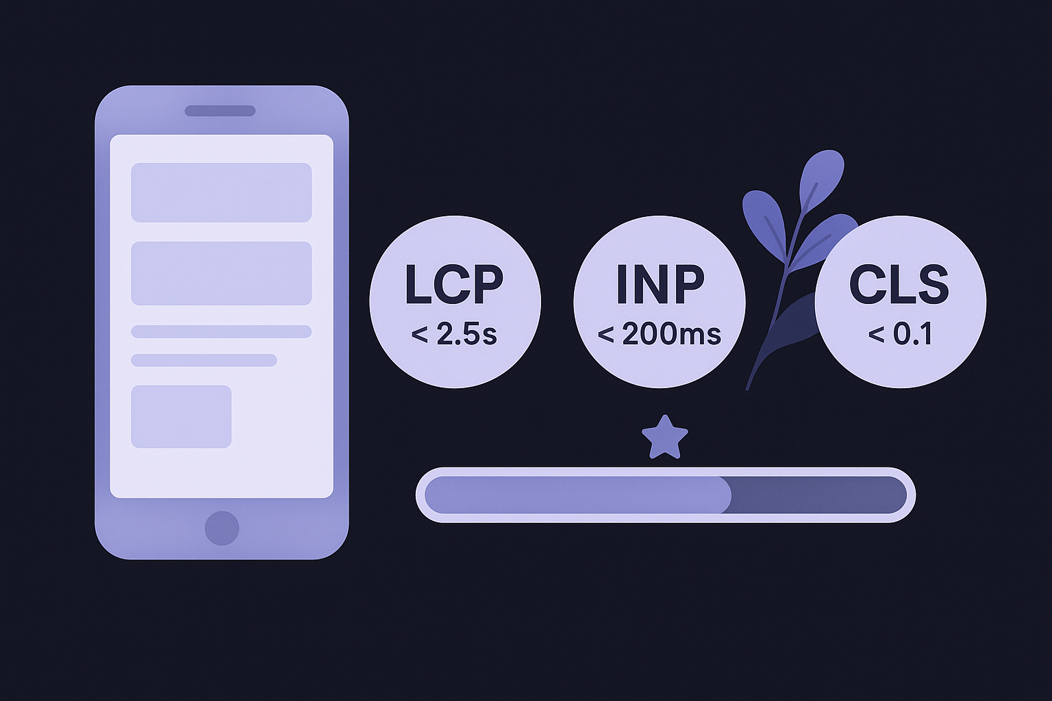
Your target benchmarks are LCP under 2.5 seconds, INP under 200 milliseconds, and CLS below 0.1. These are not aspirational goals, they are the thresholds Google uses to classify a page as providing a "good" experience. Pages that fall in the "needs improvement" or "poor" categories face a measurable disadvantage in mobile search rankings.
What has changed specifically in 2026
The biggest shift this year is the growing weight of AI-generated search results, specifically Google's AI Overviews. These pull content directly from pages that demonstrate clear structure, authority, and mobile accessibility. If your mobile experience is broken or your content is buried in accordion menus that Google's crawler cannot parse, you lose visibility in both traditional results and AI Overviews.
Search behavior on mobile has also continued to shift toward voice queries and conversational searches. Users on phones ask longer, more natural-language questions, which means your content needs to answer specific questions directly and clearly. Pages optimized for this pattern perform better across all mobile search surfaces, including AI-driven ones.
Choose the right mobile site setup
Before you optimize individual pages, you need to make sure your mobile site configuration is correct at a structural level. Google supports three approaches: responsive design, dynamic serving, and separate mobile URLs. Each has different implications for your mobile SEO optimization, and choosing the wrong one creates problems that no amount of content work will fix.
Responsive design is the right default
Responsive design uses a single URL and codebase that adjusts its layout based on screen size using CSS media queries. Google officially recommends this approach because it simplifies crawling: Googlebot only needs to index one version of your page, which eliminates the risk of content mismatches between desktop and mobile. For most sites, responsive is the correct default choice, and it stays the easiest to maintain over time.
Build your site mobile-first, meaning you design for the smallest screen before layering in complexity for desktop users. This forces you to prioritize what actually matters on a phone before adding elements that only work on larger displays.
Choosing responsive design from the start eliminates an entire category of mobile SEO problems before they can affect your rankings.
Handle dynamic serving and separate URLs carefully
Dynamic serving delivers different HTML to different devices at the same URL, while separate mobile URLs serve mobile users on a completely different domain like m.example.com. Both approaches work technically, but both introduce risks that responsive design avoids entirely.
With dynamic serving, you need to add the Vary: User-Agent HTTP header so Google knows the page content changes based on the requesting device. Without this header, Googlebot may cache the desktop version and miss your mobile content entirely. Here is what that header should look like in your server response:
Vary: User-Agent
Separate mobile URLs require canonical tags and bidirectional annotations on every page pair. The desktop page needs a rel="alternate" tag pointing to the mobile URL, and the mobile page needs a rel="canonical" pointing back to the desktop URL. Missing either annotation splits ranking signals across two URLs, which weakens both. Here is what those tags look like:
<!-- On the desktop page -->
<link rel="alternate" media="only screen and (max-width: 640px)" href="https://m.example.com/page">

<!-- On the mobile page -->
<link rel="canonical" href="https://www.example.com/page">
Given this complexity, migrating to responsive design is almost always the better long-term investment if you currently run a separate mobile site.
Make your mobile pages fast
Page speed is one of the most direct levers you have in mobile SEO optimization. A one-second delay in mobile load time can drop conversions by up to 20%, and Google's Core Web Vitals measurements make slow pages a ranking liability. Before you touch anything else, run your pages through Google PageSpeed Insights to get a baseline score and a prioritized list of specific issues to fix.
Compress and defer what slows you down
Your biggest performance wins almost always come from reducing page weight and eliminating render-blocking resources. Images are typically the heaviest assets on a page, so convert them to WebP format, which delivers significantly smaller file sizes than JPEG or PNG with comparable quality. For CSS and JavaScript, defer anything that does not need to load before the page becomes usable.
Add the following attributes to non-critical scripts to prevent them from blocking your initial render:
<!-- Defer non-critical JavaScript -->
<script src="analytics.js" defer></script>

<!-- Async for scripts with no dependencies -->
<script src="widget.js" async></script>
Eliminating render-blocking resources alone can cut your Largest Contentful Paint time by over a second on mobile connections.
Implement lazy loading for images and iframes
Lazy loading tells the browser to skip loading off-screen images until the user scrolls toward them. This reduces the initial page payload significantly, which directly improves your LCP score on mobile. The implementation is a single HTML attribute, and modern browsers support it natively without any JavaScript library required:
<img src="product-photo.webp" alt="Product description" loading="lazy" width="800" height="600">
<iframe src="map.html" loading="lazy"></iframe>
Always include explicit width and height attributes on your images. When dimensions are missing, the browser cannot reserve space for the image before it loads, which causes layout shifts that hurt your CLS score.
Reduce server response time with caching
Your server needs to respond within 600 milliseconds to give your page a realistic chance of hitting the LCP target. Enable browser caching for static assets by setting appropriate Cache-Control headers, and use a content delivery network to serve assets from servers geographically closer to your users. For WordPress sites, a caching plugin like WP Rocket or W3 Total Cache handles most of this automatically.
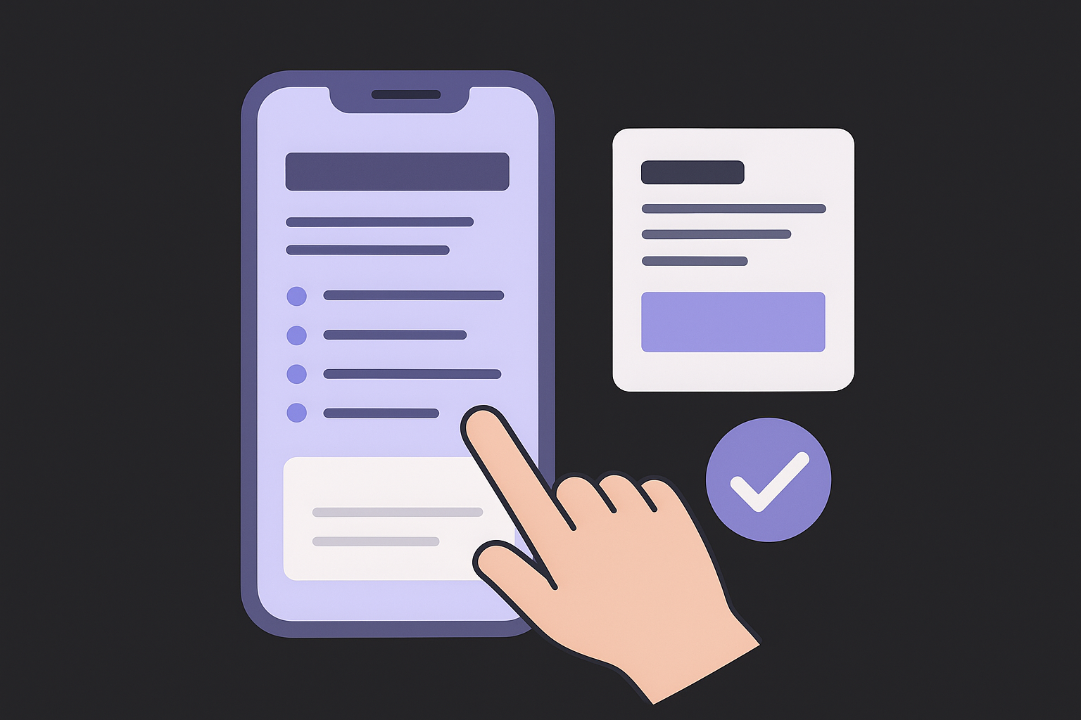
Create content that works on phones
Mobile users scan rather than read, which makes content structure one of the most important factors in mobile SEO optimization. A wall of text that works fine on a desktop becomes unreadable on a five-inch screen. If your content is not built to be consumed quickly on a phone, users bounce, and Google reads that as a signal that your page did not satisfy the search.
Structure your content for scanning
Short paragraphs and clear subheadings are not stylistic preferences, they are functional requirements on mobile. Keep paragraphs to two or three sentences maximum. Every H2 and H3 heading should tell the reader exactly what they will find in that section, so they can skip to what they need without scrolling through irrelevant content.
Use bullet lists to break up grouped information, but keep each list item concise. Here is a content structure template that performs consistently well on mobile:
H2: Core topic
  - Opening sentence: answer the question directly
  - 2-3 short paragraphs, one idea each
  - Bullet list or table if comparing options

  H3: Sub-point
    - 2-3 short paragraphs
    - Concrete example or code snippet
Putting your main answer in the first sentence of each section dramatically increases your chance of appearing in Google's featured snippets on mobile.
Write for conversational search queries
Voice search and mobile typing push users toward longer, question-based queries. Instead of targeting "mobile page speed," write content that directly answers "how do I make my mobile pages load faster?" Structure at least one section of each article as a direct Q&A by using the question as a subheading and answering it in the first two sentences below.
Concrete example: If your target keyword is "best mobile checkout process," add an H3 like "What makes a mobile checkout process work?" and open with a direct two-sentence answer. This format matches how Google surfaces content in AI Overviews and featured snippets on phone screens.
Keep font sizes and tap targets usable
Text that is too small to read without zooming pushes users away immediately. Google recommends a minimum body font size of 16px for mobile readability. Any button or link that users need to tap should have a touch target of at least 48x48 pixels, which prevents the mis-taps that inflate your bounce rate and signal a poor user experience to Google's ranking systems.
Fix mobile crawl and index issues
Even a fast, well-structured site loses rankings when crawl and index errors prevent Google from reading your pages correctly. Google cannot rank content it cannot access, which means fixing these issues is a non-negotiable part of any serious mobile SEO optimization effort. The most common problems are blocked resources in robots.txt, missing structured data on mobile templates, and rendering failures that Googlebot silently encounters without alerting you.
Check how Googlebot renders your pages
The URL Inspection tool inside Google Search Console is your starting point. Enter any page URL, click "Test Live URL," and open the "Screenshot" tab to see exactly what Googlebot's smartphone crawler sees. A broken layout, missing images, or blank content sections in that screenshot means you have a rendering problem that is actively hurting your rankings.
Run this check on your highest-traffic pages first, then track your findings in a simple table:
| Page URL | Renders Correctly? | Issue Found | Fix Applied |
|---|---|---|---|
| /home | Yes | None | N/A |
| /product/x | No | CSS blocked | Updated robots.txt |
Fix robots.txt mistakes that block key resources
A robots.txt file that accidentally blocks CSS or JavaScript files is one of the most damaging and easy-to-miss crawl mistakes. When Googlebot cannot load the files your pages need to render, it sees a broken layout and ranks that page accordingly. Open your robots.txt and check for rules like this:
# Problematic - blocks CSS needed for rendering
User-agent: *
Disallow: /wp-content/themes/
Remove or narrow any disallow rule that blocks style sheets, script files, or image directories. Your goal is to ensure Googlebot can access every resource required to render your mobile pages fully.
Blocking rendering resources in robots.txt is invisible to you but immediately visible to Google, and it tanks your mobile rankings fast.
Keep structured data identical on mobile
Structured data markup tells Google what your content means, and it must appear on your mobile pages just as it does on desktop. If you added schema only to desktop templates, Googlebot's smartphone crawler will not see it, and you lose eligibility for rich results in mobile search.
Use Google's Rich Results Test to verify your markup renders correctly on mobile. Confirm that every schema type you use, such as Article, Product, or FAQ, is valid and present on the mobile version of each page.
Optimize snippets for mobile SERPs
How your pages appear in mobile search results determines whether users click or scroll past. Mobile screens cut off longer text, so your title tags and meta descriptions need to fit tighter character limits while still communicating enough to earn the click. Getting this right is a core part of mobile SEO optimization that most sites overlook until rankings plateau.
Write title tags and meta descriptions for small screens
Mobile SERPs display roughly 50-60 characters of a title tag before cutting it off, which is shorter than the 60-70 characters that desktop results typically show. Front-load your primary keyword and most compelling information so nothing critical gets truncated. Keep your meta descriptions under 120 characters on mobile, since anything beyond that disappears with an ellipsis before users can read it.
Use this template when writing each page's snippet:
Title tag (50-60 characters):
[Primary Keyword]: [Clear Benefit or Action]

Meta description (under 120 characters):
[Direct answer or promise] + [specific detail] + [reason to click]

Example:
Title: Mobile SEO Optimization: 10 Fixes That Work
Meta: Speed up your mobile pages, fix crawl errors, and rank higher.
Practical steps you can act on today.
Front-loading your keyword in the title tag ensures Google displays it even when the full title gets cut short on small screens.
Target featured snippets and AI Overviews
Featured snippets appear above organic results on mobile and occupy the entire visible screen before users see the first blue link. Winning one means you capture attention ahead of every other ranked page. Structure your content so that a clear, two-to-three sentence answer appears directly under a question-formatted H2 or H3 heading, which is the pattern Google consistently pulls into snippet boxes.
For list-based snippets, format your answer as an ordered or unordered list with six items or fewer. Tighter lists perform better than longer ones, and Google pulls these directly into mobile results. For paragraph snippets, keep your answer between 40 and 60 words, written in plain language without hedges.
AI Overviews on mobile draw from pages that demonstrate clear structure and direct answers. Every section of your content should open with the most important point first, then support it with detail. This approach aligns with how Google's AI systems extract and surface information, which gives you a real advantage in both traditional snippets and AI-generated results.
Track rankings and keep improving
Mobile SEO optimization is not a one-time project you complete and move on from. Search rankings shift constantly as Google updates its algorithms, competitors publish new content, and your own site changes. You need a repeatable tracking system that gives you clear signals on what is working, what has slipped, and where to focus your next round of improvements.
Set up a tracking baseline
Start by connecting your site to Google Search Console if you have not done so already. The Performance report shows you click-through rates, impressions, average position, and actual queries people use to find your pages. Filter specifically by device type using the "Devices" tab so you see mobile performance separate from desktop, because a page that ranks well on desktop can be quietly underperforming on mobile without you noticing.
Track these core metrics on a monthly basis so you have enough data to spot trends rather than reacting to weekly noise:
| Metric | Where to Find It | What to Watch For |
|---|---|---|
| Mobile clicks and impressions | Search Console Performance | Drops signal ranking loss |
| Core Web Vitals scores | Search Console Core Web Vitals | Pages moving into "poor" status |
| Crawl errors | Search Console Coverage | New mobile-specific errors |
| Average mobile position | Search Console Performance (filter: Mobile) | Position rising above 10 |
Tracking desktop and mobile rankings separately lets you catch mobile-specific drops before they compound into a larger traffic problem.
Review and act on what the data shows
Pull your Search Console data every month and look for pages where mobile position is worse than desktop position by more than three spots. That gap usually points to a specific technical or content issue: slow load time, missing structured data on the mobile template, or content that does not match conversational search intent on phones. Prioritize those pages and run them through Google PageSpeed Insights and the URL Inspection tool to diagnose the specific problem.
After fixing any issues, set a reminder to recheck the same pages in four to six weeks. Rankings respond to changes at different speeds depending on how frequently Googlebot recrawls your pages. Consistent monthly audits, rather than large periodic overhauls, produce steadier ranking gains over time and make it easier to connect specific changes to measurable outcomes in your data.
Next steps
Mobile SEO optimization is a continuous process, not a one-time project. The steps in this guide give you a clear path: confirm your site uses responsive design, fix your Core Web Vitals, structure content for mobile readers, resolve crawl errors, sharpen your snippets, and track your rankings month by month. Start with the issues that affect your highest-traffic pages first, then work down the list systematically.
Consistent content publishing is one of the biggest factors separating sites that climb rankings from those that stay stuck. Producing daily SEO-optimized articles built for mobile from the ground up, without managing the entire workflow yourself, is exactly what RankYak handles. It covers keyword research, content creation, and automatic publishing so you can focus on running your business instead of chasing search rankings. Start your free trial of RankYak and see how much ground you can cover in the first week.

Get Google and ChatGPT traffic on autopilot.
Start today and generate your first article within 15 minutes.
SEO revenue calculator
How much revenue is your website leaving on the table?
Take a quick quiz and see exactly how much organic revenue you're missing out on, along with personalized tips to fix it.
-
4 questions, under 1 minute
-
See traffic and revenue potential
-
No email required
Free · takes 1 minute · no signup needed
Question 1 of 4
Question 2 of 4
Question 3 of 4
Question 4 of 4
Your SEO growth potential
Extra visitors / month
after 6-12 months of consistent publishing
Revenue potential / year
at your niche's avg. conversion rate
Articles needed (12 mo)
to reach this traffic level
ROI with RankYak
at $99/mo ($1,188/year)
To hit that number, you'd need to:
- Build a topical authority strategy for your niche
- Research keywords & map out a full topical cluster
- Write, edit & publish an article every single day
- Build backlinks to the articles you publish
RankYak handles all of this automatically, every day.
* Estimates based on industry averages. Results vary by niche, competition, and domain authority. Most SEO results become visible after 3-6 months of consistent publishing.